Look-alikes · Palestine · Syria
Palestine vs Syria
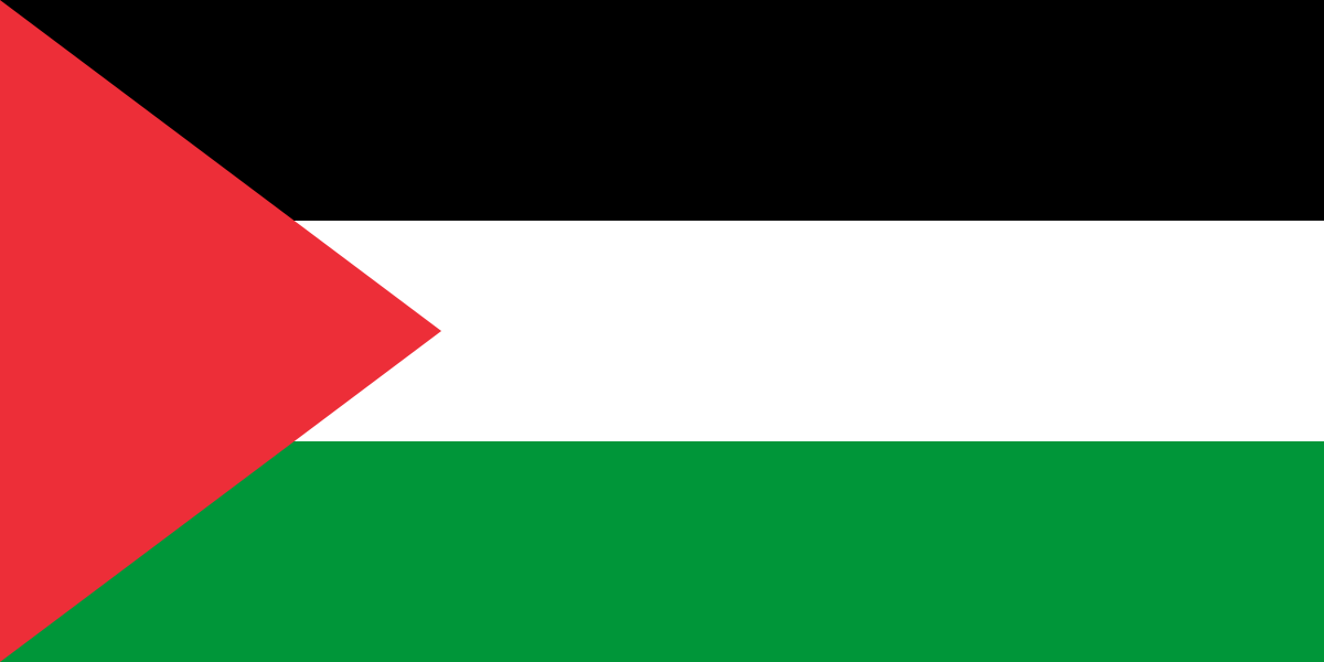
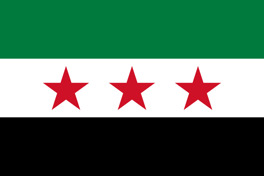
Two copies of one picture are 0% apart and the widest pair in the world is 100%. The app files them together as Pan-Arab Colors.
Palestine and Syria are 56% apart. A typical pair of flags is 68% apart.
Where the difference is
Each colour on Palestine, matched with the nearest colour on Syria, and how far apart the two are, the number is the worst single tile, out of 255.
- #000000#0000000
- #009639#007a3d28
- #ffffff#ffffff0
- #ed2e38#ce112631
The colour that separates them is a red: #ed2e38 against #ce1126, 31 apart.
How they are put together
Both were measured as horizontal bands.
Only Palestine: a triangle at the pole.
Palestine runs black, white and green from the top. Syria runs green, white and black from the top.
Palestine is flown 2.00 : 1 and Syria 1.50 : 1.
What each one carries
Syria carries a star. Palestine carries nothing at all.
How the number was arrived at
Both flags are drawn at 64×48 and cut into squares 8 across. Each square is averaged to one colour, and the score is the worst single square, so two flags that agree everywhere except one corner are as far apart as that corner, which is the right answer to a question about whether anybody could tell them apart. 0 is the same picture; the number is the worst single tile, out of 255.
On that scale Palestine and Syria score 142 out of 255, which is the 56% above.
It cannot see everything. Both flags are stretched to the same box, so Indonesia and Monaco, which differ in nothing else, are measured as their reds rather than as identical. The look-alikes page sets out the rest.
Also close
The flags the pipeline measured nearest to these two.